Lexington Christian Academy (mobile)
Lexington Christian Academy (mobile)
About this project
The challenge:
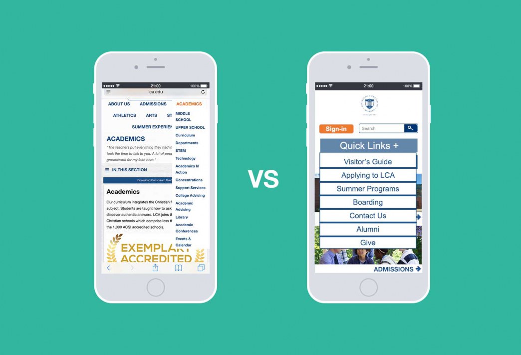
Lexington Christian Academy, a private college prep school based in MA, gave me the challenge of redesigning their 5 year old website as seen in my portfolio. I had done the research and mockups to produce what I thought was a much improved, much more user-friendly website built on a professional CMS called Finalsite. The developers at Finalsite assured me the mobile version would be responsive and mobile-friendly, of course. Given that our userbase did not use mobile much, I didn’t give it much thought and focused my efforts on the desktop version.
Lesson 1: Now that mobile-first is the trend and our userbase is catching on, our mobile version is woefully outdated and not user-friendly.
After the website was finished, it only took a whole long year for me to realize the approach should have been mobile-first so that we wouldn’t be playing catch up now.
Research phase:
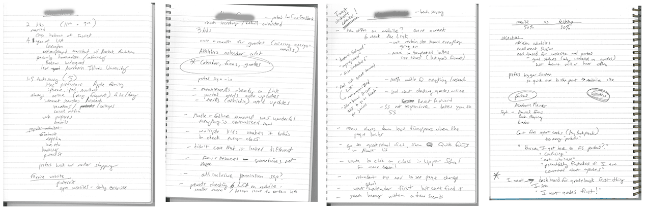
First, I researched other school websites that went with the mobile-first approach and noticed the vast difference in design. While our current desktop version was fantastic for SEO, it was missing a growing segment of people who were using their mobile devices for preliminary research on potential private schools. To compound the issue, the digital advertising campaign done through their marketing department was churning out ads that users were primarily clicking through to on mobile devices, which drove them to the mobile version of the website. This was greatly affecting our user experience in a negative manner as seen in the bounce rate and in other metrics.
User interviews and focus groups revealed these issues and negative experiences. Most users were not happy with the mobile experience at all. Some were not happy with the desktop version at all. The word I heard the most was: frustration.
Diagnosis:
Due to the structure of the CMS, the mobile version of the website was simply a rearrangement of the content to fit the screen size of a smartphone. It was mobile-friendly and responsive, but it was not user-friendly.
- Mobile navigation was difficult to find and use as small text links
- Drop down menus were buggy and not big enough for fingers
- The rearrangement of content didn’t make sense when fitted to a narrow screen
- Text was too long for mobile users
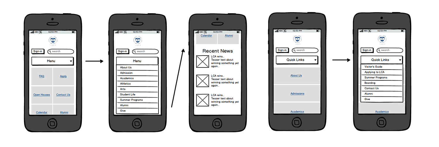
Wireframing phase:
Wireframes were quickly sketched out in Balsamiq with a strong sense of how a successful design should be based on previous feedback and research I had gathered informally. I then moved to the design phase quickly in order to start user testing asap.
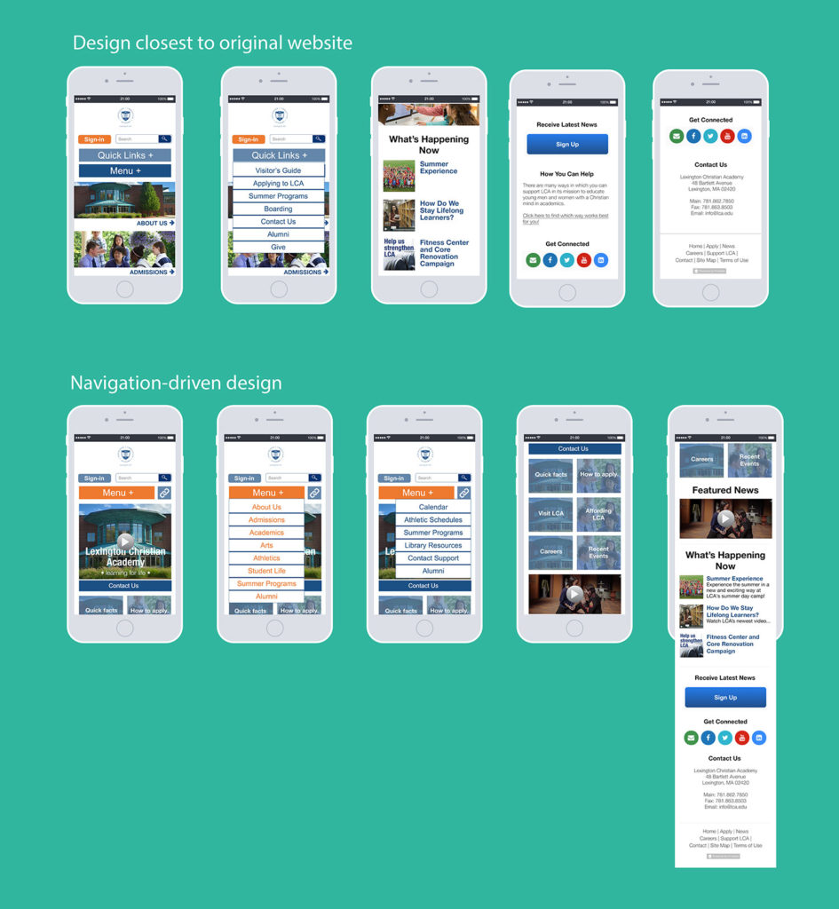
Design phase:
After the wireframes, the design phase flew quickly. I knew I wanted to make everything bigger and more button-like with the kind of content that was marketed to prospective families interested in a faith-based private education. While the color palette stayed the same, the new mobile version was designed to increase fluid navigation and general ease of use for tapping fingers rather than mouse clicks.
When conducting user testing, users reacted very positively stating they would “be using mobile more often” if the design was changed to what they were currently seeing on the screen. Users were pleased to find bigger, tappable buttons with content relevant to what they would normally search for as both a current enrolled family, and as a prospective customer.

