Higg Co – Adoption Tool UX enhancements
Higg Co – Adoption Tool UX enhancements
About this project
The challenge:
Pop quiz, hot shot! How do you approach UX enhancements (aka redesign) of a tool that stakeholders keep changing their minds on?
Answer: with a lot of patience!
The Adoption Tool is Higg’s solution to helping Brands & Retailers request that their business partners (mostly factories/facilities) use the Higg Index platform. It was originally designed by contractors and needed some updating. The direction I was given by the Product Director was:
- update UI
- update navigation
- update table to include new features
- add conversion funnel
It sounded relatively straight-forward, but the design process turned out to be extremely iterative due to changing stakeholder goals and ambiguity around what clients really wanted.
Research phase:
Researching the Adoption Tool consisted of speaking with a Client Success Manager who gladly showed me the ropes of the tool and also spoke transparently of its flaws. I find that Client Success and Customer Support agents are a solid source of user feedback when user testing is not possible. They are constantly listening to clients and experiencing first-hand the customer’s usability issues while trying to solve the issue for them. Having a good relationship with these two departments is crucial to a UX Designer!
Diagnosis:
After receiving some training for the Adoption Tool, I immediately noticed many usability issues such as irregular page layouts, lack of labels, lack of help text, and hard-to-find features such as “download report” buttons. I knew I had to include these elements to increase a user’s comprehension of the page and hopefully guide them to achieving their goal of properly adopting facilities and analyzing where facilities might not be progressing through the conversion funnel.
Wireframing phase:
Due to the speed of the sprints and primary goal to deploy code, my wireframing phase essentially became non-existent. I went straight to Figma to create full-color, code-ready designs that were iterated upon quickly and moved into development shortly after.
Design and Prototype phase:
The design/wireframing phase started off fine, but soon turned into a process of multiple iterations for the following reasons:
- After designing the first round of design for the funnel chart which was horizontal, I later learned by chatting with the front-end developer that a horizontal layout was not possible with our UI library (Kendo UI).
- Once the funnel chart was edited to become vertical, the Client Success team wanted to add enhancements to the chart that Kendo UI didn’t support. The front-end developer on the project had to hack the features in and while he was able to do so, we noticed that adjusting the browser width would break the chart.
- Once the funnel chart was finally in a good place code-wise, we went through several more iterations because Client Success wasn’t quite sure what kind of funnel information the clients wanted. Did they want to see only the percentage of client accounts that made it through the funnel to the terminal status (creating a facility account on Higg) or did they want to see the percentage of clients that DIDN’T make it through the funnel? Did they want to know why?
- The other question that came up was, did we want to show a single funnel conversion chart that contained the facility accounts that made it through the funnel or did we want two versions of the funnel showing the accounts that stayed in funnel and another version that dropped out? How should we show two charts: side by side or in a tab version?
We finally decided on a tabbed version of the data with one tab showing the funnel chart with facility accounts’ PROGRESS vs facility accounts’ CONVERSION. What’s the difference? The progress funnel showed the percentage of accounts in each stage of the adoption process at all times, and the conversion chart showed the progressive reduction of accounts as they tried to achieve terminal status. Most importantly, it was showing the percentage of drop-offs as well.
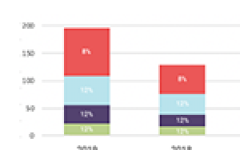
Old designs
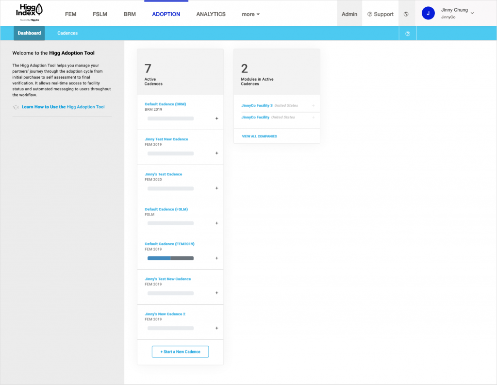
Scenario: User (Brand & Retail persona) navigates to their Adoption Tool and lands on this page that shows how many “cadences” are active and how many “modules” are in active cadences. The first problem with this is that the word “modules” wasn’t quite accurate and there had been much internal discussion about moving away from the word “module” and replacing it with the word “accounts” as we were really tracking how many facility accounts were adopted into a cadence. A Higg cadence was the amount of time an account had to complete a sustainability assessment.
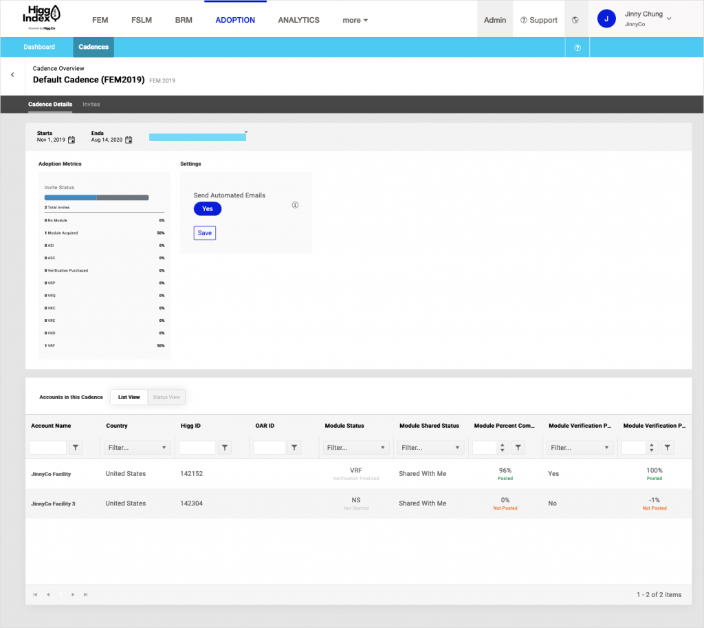
Scenario: Once the user clicked on a cadence it would take them to this landing page–the cadence details page. From here it got really wonky.
The navigation was hard to understand since it was starting to nest itself. The previous solution was to add a back button right beneath the secondary nav in the blue bar. That might have worked if it hadn’t been for the black bar that acted as another navigation element. We had 4 nested navigation rows using a lot of bars UI and I felt it was not visually friendly to the user. How could we break up the navigation UI visually and functionally?
Also, the main content area was comprised of a metrics module showing how accounts were progressing through the adoption process per stage and a settings module that controlled email campaign automation. The two modules had very different intents and needed to be changed to make that apparent.
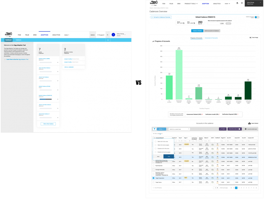
New designs:
(first iterations)
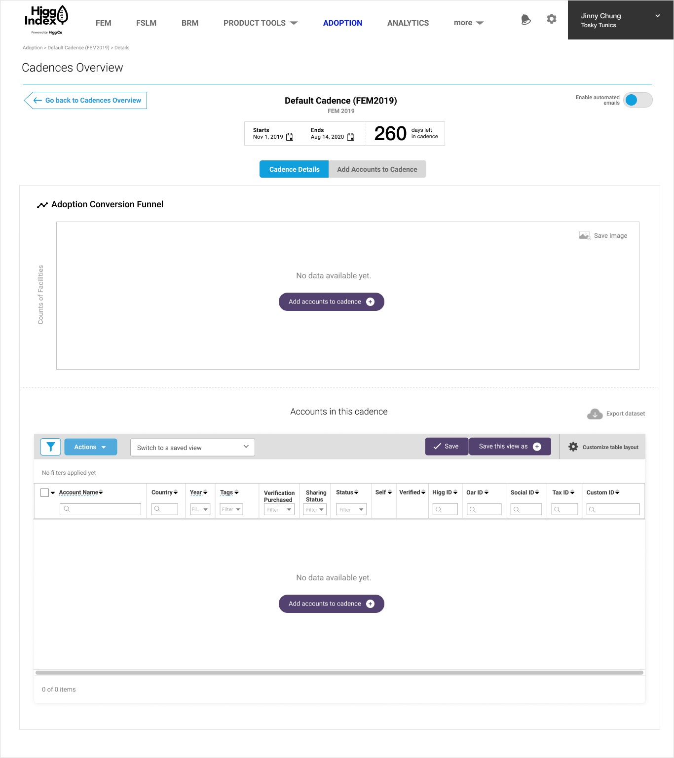
Page: New Adoption Tool landing page
Scenario: The Product Director and I chatted about blowing up the current landing page because it was deemed useless and redundant. What we theorized users really wanted was data. They wanted to know how many facility accounts made it to conversion (adoption) and where they were getting stuck or dropping off. This would inform them as to how they could offer help for facilities.
First iteration: Have users land on a funnel conversion chart right away on top of the page and place a table of accounts containing greater account details below it. Ideally, we wanted the funnel conversion chart to interact with the bottom table to act as a filter for specific accounts users wanted to see. This page shows the empty state of the landing page for new users or users starting a new cadence.
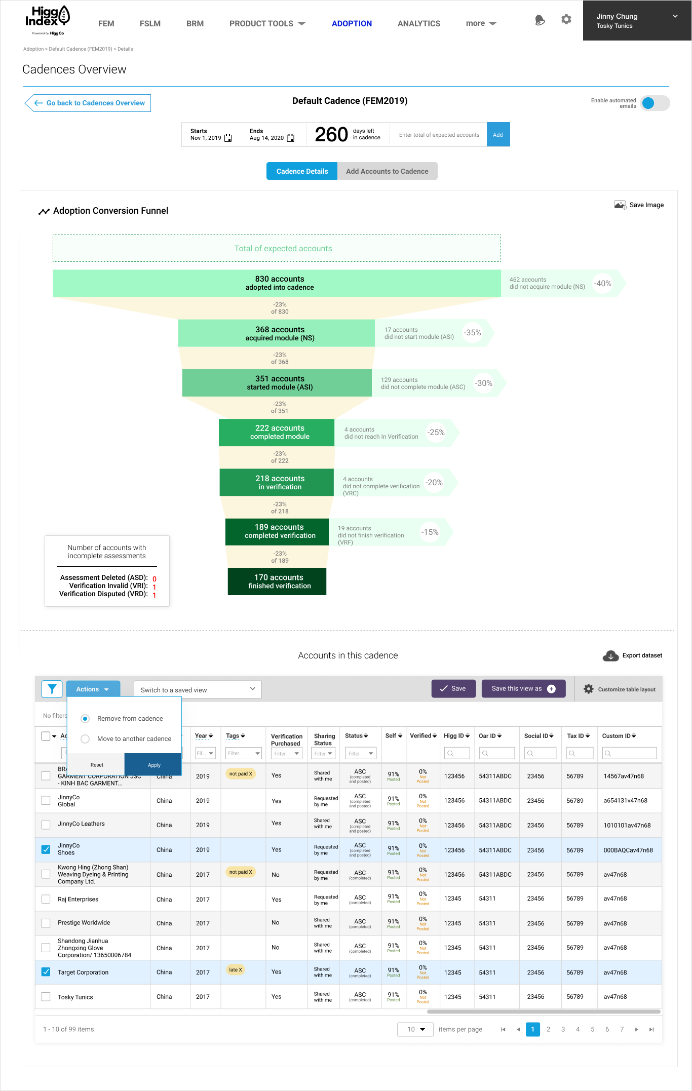
Once facility accounts were added to a Cadence, data would start showing up revealing where each account was in the process. For example, were most accounts in “Not Started” phase? How many accounts didn’t start their sustainability assessments and how many got to verification phase? These percentages were very important for data analysis on the Brand & Retail end.
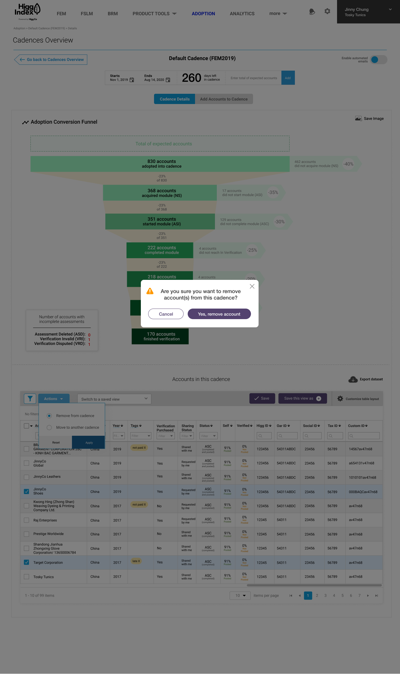
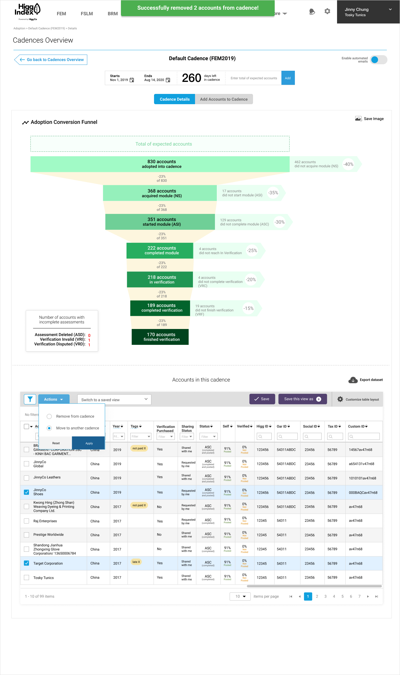
Once it was agreed upon to add a funnel chart to the landing page, it made sense to update the table UI since updating the component library was one of my projects at Higg. The new table UI included a toolbar that enabled users to perform bulk actions such as moving multiple accounts to another cadence or removing them form the cadence.
If a user wanted to move their selected accounts to another cadence, a modal would appear to confirm this was the action they wanted to complete. I had two versions for the modal.
Version 1: This version was an all-in-one modal that asked if the selected accounts in that particular cadence should move to whichever cadences were available in the list.
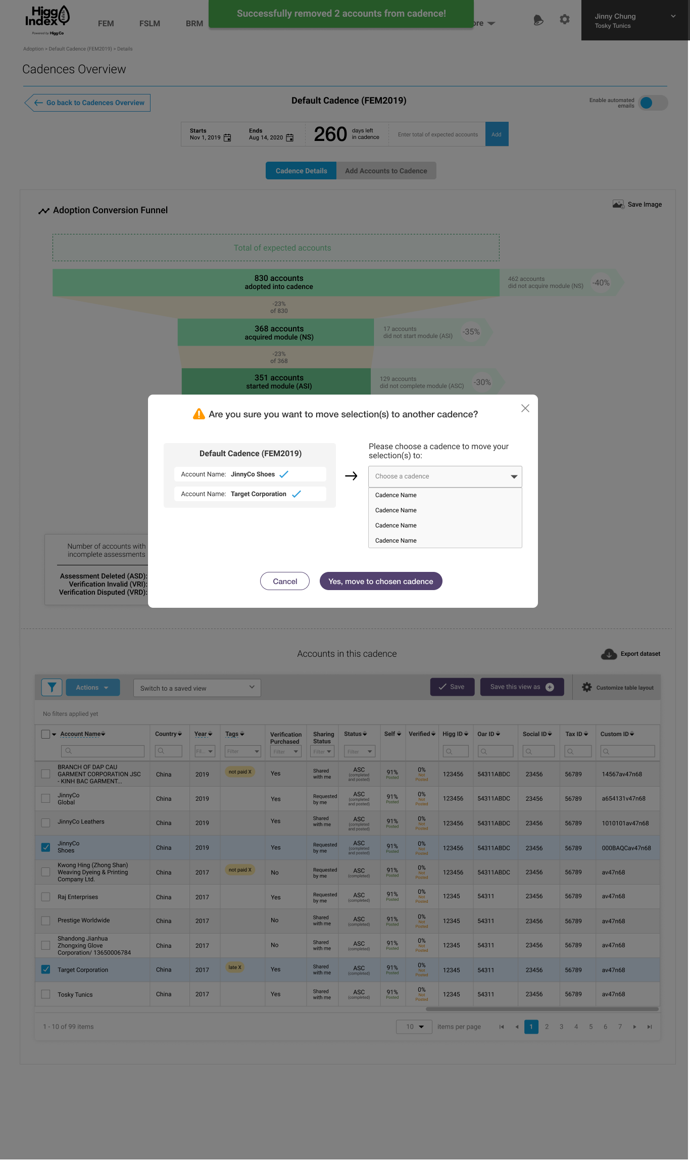
Version 2: This modal was broken into 2 steps.
Step 1: Choose the new cadence you’d like to move the account(s) to
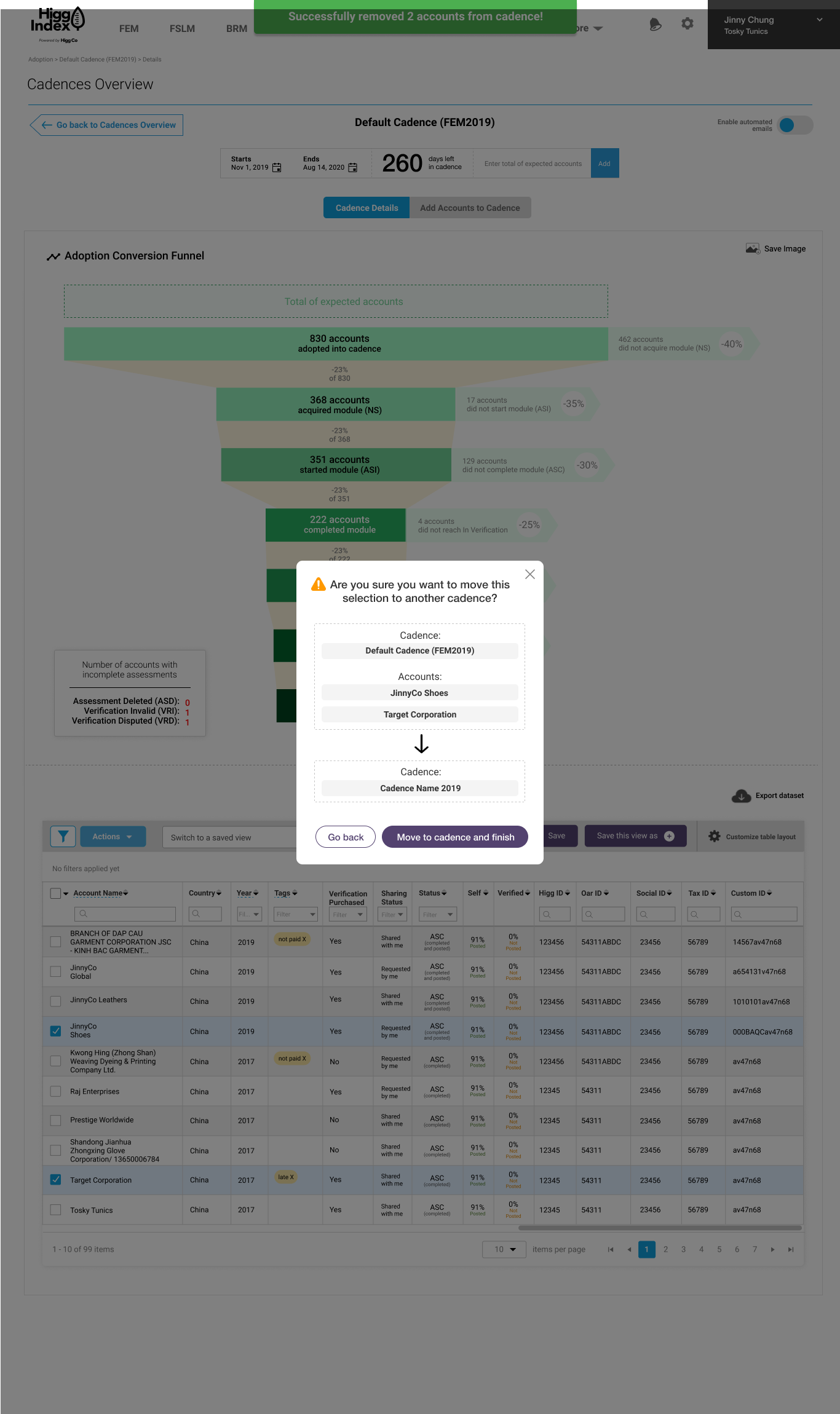
Step 2: Confirm the action is correct
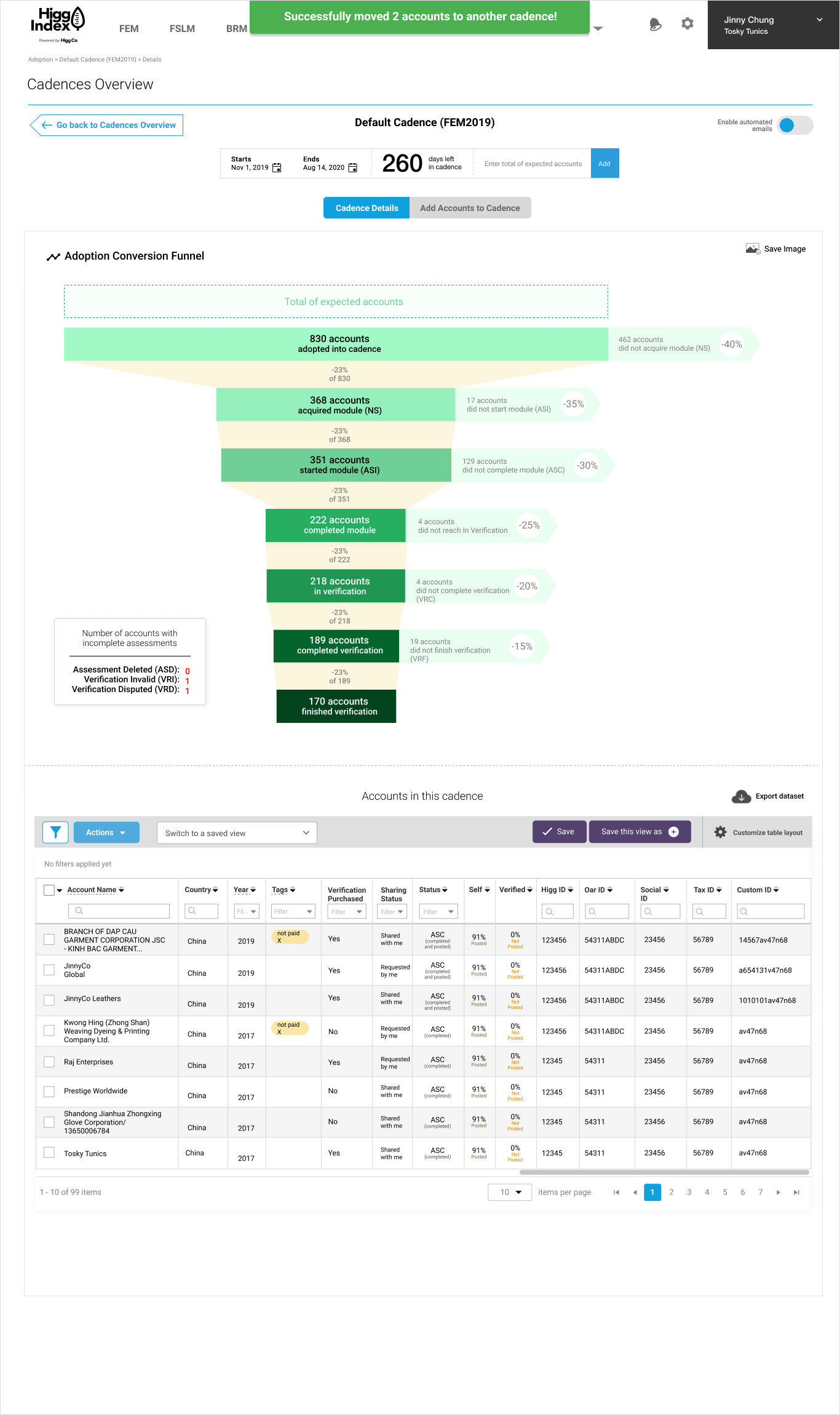
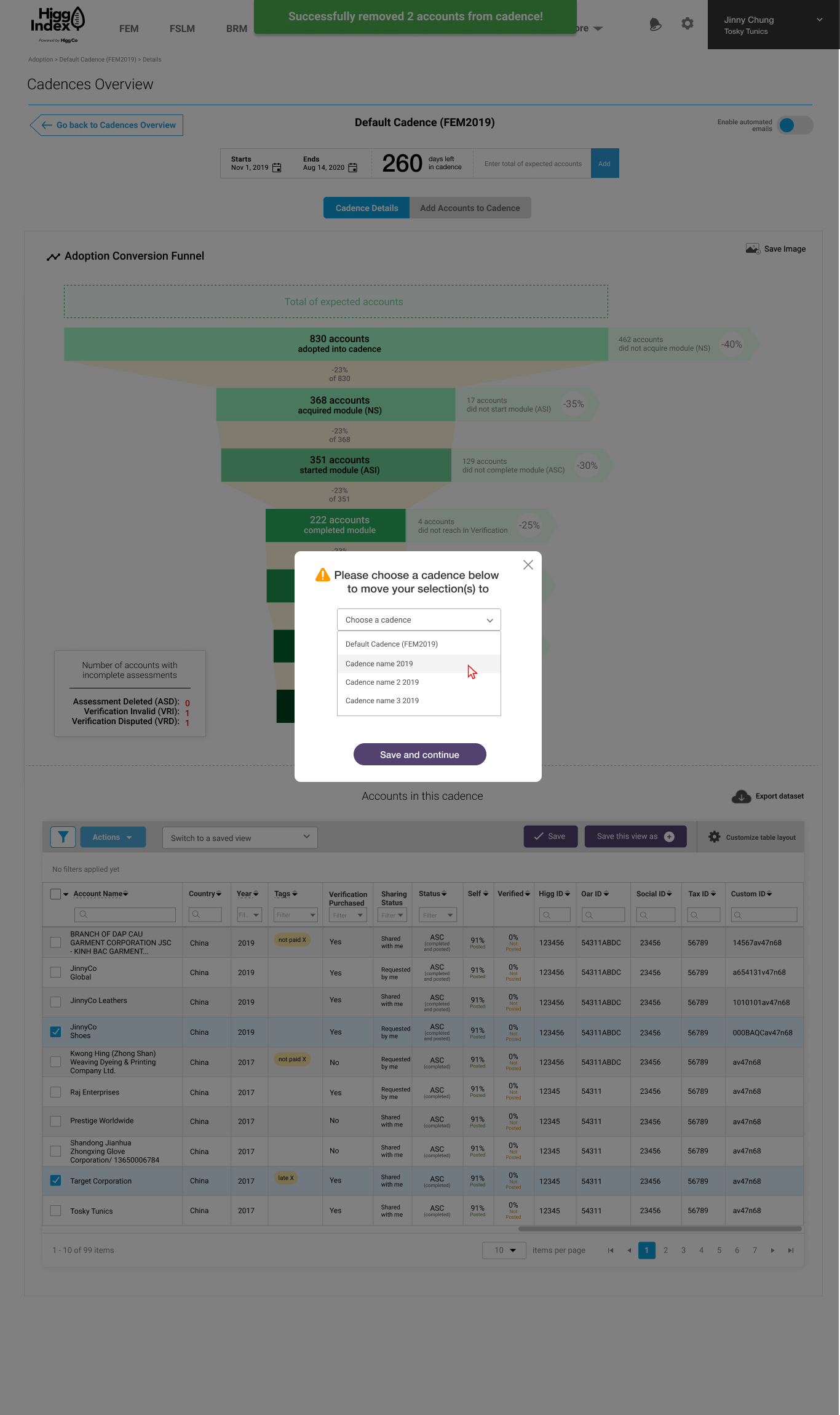
Success toast!
New designs:
(subsequent iterations)
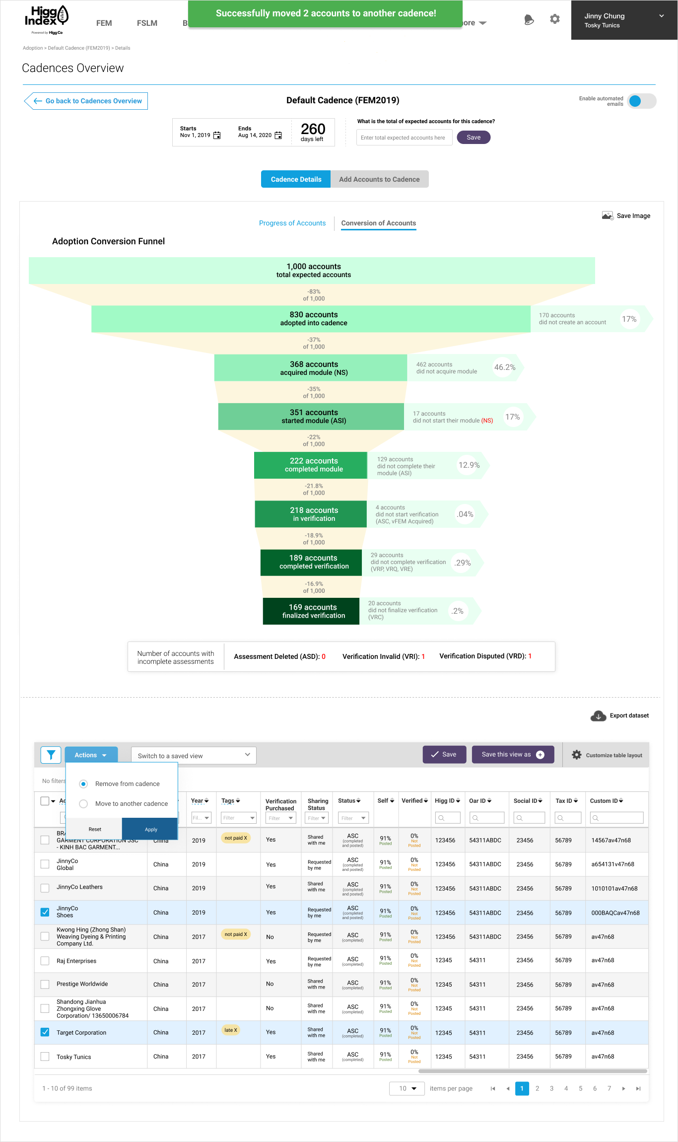
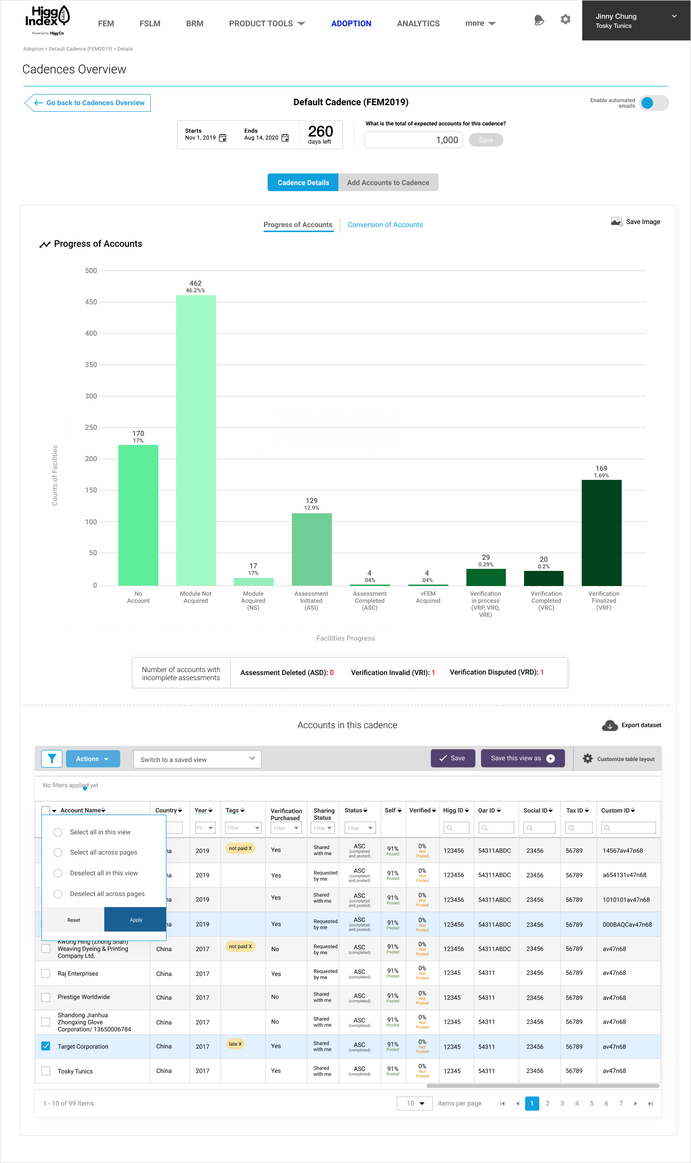
This UX enhancement project went through several iterations and one of the major iterations included adding a way for users to flip between different views of the chart. Client Success insisted that we give Brands & Retailers the option of seeing the funnel conversion data AND how many accounts per status data.
I debated over how to show this in an elegant way. The first thought was to put them side by side, but it would be overwhelming to the end user. The second option was to add a tabbed layout which I was torn about since the navigation was already so nested. In the end, Client Success team chose the tabbed version which I offered as a simple text solution with a blue CTA underline color.
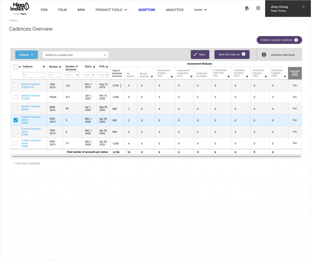
The Cadences Overview page is supposed to show how many facility accounts were in each step of the cadence adoption process. This was primarily a UI improvement for the table. The UI I updated were:
- Update the general table UI like colors, fonts, font sizes, lines, alternating row colors, updated search fields, updated sorting icons
- Added an “automated emails enabled” column to quickly show which cadencers had that feature turned on/off
- Reorganized column headings
- Added total accounts per status at the bottom of table