Higg Co – Navigation redesign
Higg Co – Navigation redesign
About this project
The challenge:
Higg Co is an amazing company that I was fortunate enough to partner with to discover and develop ways to enable companies to measure and improve their sustainability efforts. Spun off the Sustainable Apparel Coalition, Higg Co created the Higg Index, a platform that global clients logged into to complete sustainability assessments in environmental, social, and product, and measure how their business and their business partners were doing compared to internal and external goals. The challenge was that this platform had been through several design iterations with different designers which gave the platform a disjointed visual aesthetic and user experience. The other challenge — I was the only in-house designer and it was a lot of work! But good work =)
Research phase:
Research consisted of talking to coworkers who had been with Higg from the beginning; who knew why certain design decisions were made and where design was an afterthought to pushing out deliverables. As with many startups, design is usually folded in after the product is already launched and developer resources were limited and focused on new releases. This is typical and usually a challenge I face with startups since I need to weigh what redesigns there is appetite and time for, and new features take precedence (and even more time) to think about. Luckily, there was appetite to make improvements to the navigation.
Diagnosis:
I took a good look through the platform and realized much of the bad user experiences had to do with the organization of the tools which manifested in the navigation. Since new products were being rolled out quickly and there was uncertainty around where each new product would live, I focused on fixing the lack of responsiveness of the platform since Google Analytics revealed to me that many users checked their mobile devices to view certain parts of the Higg Index and the platform was not mobile-friendly. We would figure out where the products would live permanently later!
Wireframing phase:
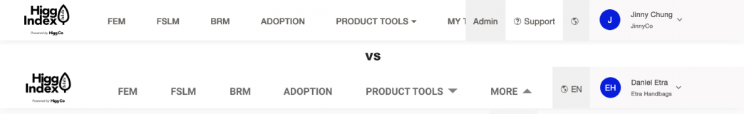
Due to the speed of the sprints and primary goal to deploy code, my wireframing phase essentially became non-existent. I went straight to Figma to create full-color, code-ready designs that were iterated upon quickly and moved into development shortly after. The screenshot on the left shows what the navigation looked like when the browser was under 1440px. The screenshot on the right showed a simple solution for making the nav responsive and look good at 1366px wide which is what Google Analytics revealed to me as the most popular browser width for our users.
Design and Prototype phase:
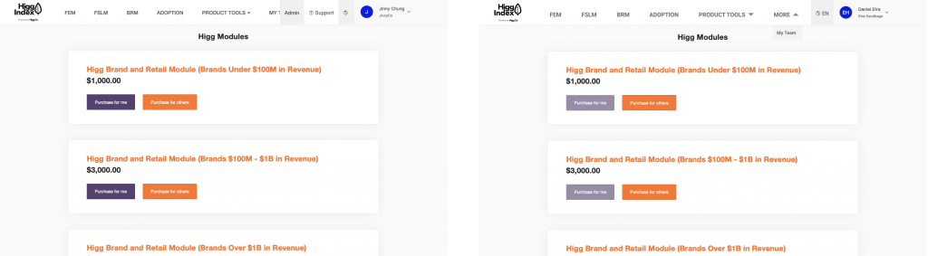
Once the responsiveness was implemented, it was a relief as we discovered that more and more users were turning to mobile devices for initial exploration, research, and light tasks. Large screens were also popular among our users as well as iPads as a significant number of users were factory employees who needed a portable device to carry while completing their sustainability assessments on the factory grounds.
One step further:
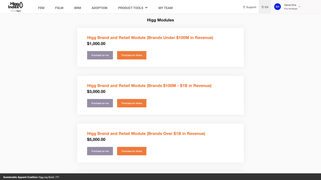
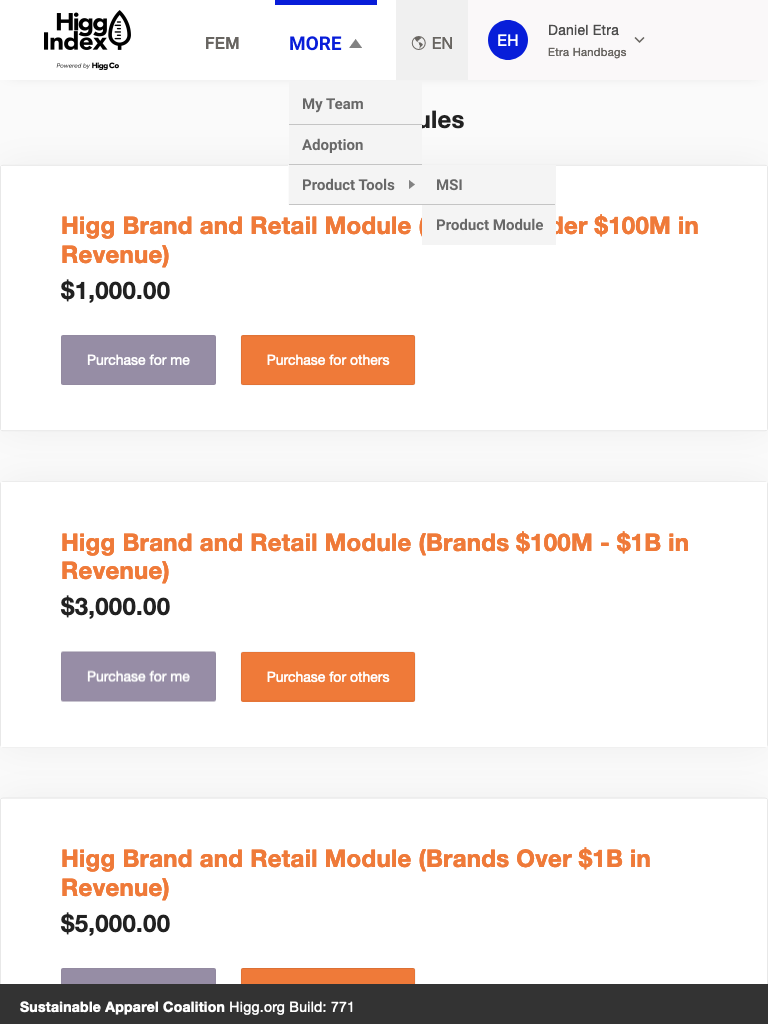
However, making the navigation responsive was not enough. I proposed updating the style as well because the current use of gray colors gave users the impression that elements were disabled and were hard to read. Using the black from the Higg logo and removing most of the light gray, I proposed a new look for the nav.