i-PRO 8.0
i-PRO 8.0
About this project
The challenge:
i-PRO is a global camera manufacturer and Video Management System company within the security and surveillance industry. They manufacturer some of the best cameras in the world with sophisticated features such as AI identification of facial features, sound distinction, and License Plate Recognition.While i-PRO boasts some of the best hardware in the industry, their software had fallen behind the times and needed an extreme overhaul in both the codebase and their visual design. i-PRO 7.X needed to transition to i-PRO 8.0 with a code refactor and visual redesign.
Although I was hired to update the design and improve usability, it proved extremely challenging because:
- i-PRO’s corporate HQ (based in Japan) did not understand the value of UI/UX Design as they were primarily Sales and Engineering driven.
- The codebase was not built to scale so minor changes could potentially break things.
- Internal stakeholders were very resistant to change as they were used to copying competitors and not pushing for innovation.
- Previously, developers were designing the product and some developers did not want to let go of this responsibility.
Research phase:
Much of the research phase consisted of competitive analysis and attending trade shows to see what the security and surveillance landscape was like. Speaking with industry professionals like police chiefs, school administrators, IT professionals, camera integrators, etc. also helped round out my research. I learned much of the industry copied each other, but the companies that didn’t were able to attract a piece of the market that the older, outdated companies couldn’t retain. Unfortunately, i-PRO (despite its amazing cameras) was falling behind due to unimpressive software offerings.
Diagnosis:
The visual design needed a serious upgrade, with ease-of-use in mind. I knew that the Tech Support team leaned heavily on documentation to train users on how to use our software, but I knew that if we could improve intuitiveness in our UI and in our workflows, we wouldn’t need to train our users so intensely.
I also wanted to incorporate our brand colors (indigo, turquoise, salmon pink) into the design since we were still using the old brand colors from a previous acquisition (orange and black). Not only were the colors swapped out, but I incorporated modern components like rounded containers and input fields, flat icons, more negative space, and overall cleaner aesthetic to the look and feel of what was going to be i-PRO 8.0.
Wireframing phase:
I decided to skip wireframing because I was focused on re-branding and re-visualizing the i-PRO look before I tackled the feel of the products. Once the visual design was crystallized, I worked on known usability issues derived from feedback I collected over several months of user testing and user interviewing.
Design phase:
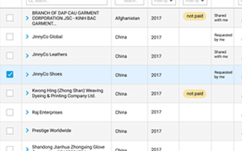
Some of the designs I worked on tackled usability issues with our user onboarding and camera setup workflows. Our competitors had the capability of detecting cameras that were hooked up to the server and auto populate them in the cameras list panel. i-PRO did not have this capability and required that users set up cameras manually and import them into the VMS for them to display in the cameras list panel.
Users were also frustrated by the size of the teeny tiny font (our users were primarily in their 40-50’s) and by the lack of accessibility design. i-PRO’s current designs incorporated black, gray, white, and an occasional splash of orange which made it look “halloween” and outdated, hard to read, and generally hard to understand.
Drawing from my extensive SaaS and cloud UI based design experience, I drafted some concepts for review.
i-PRO 7.X (current, old designs)
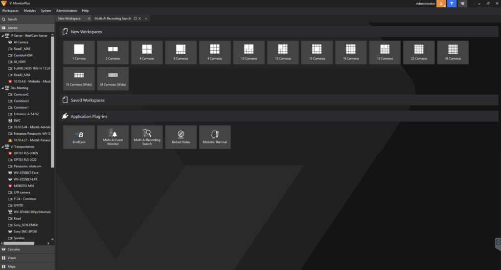
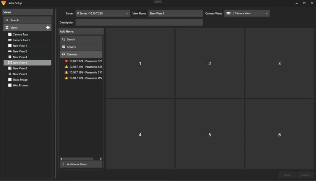
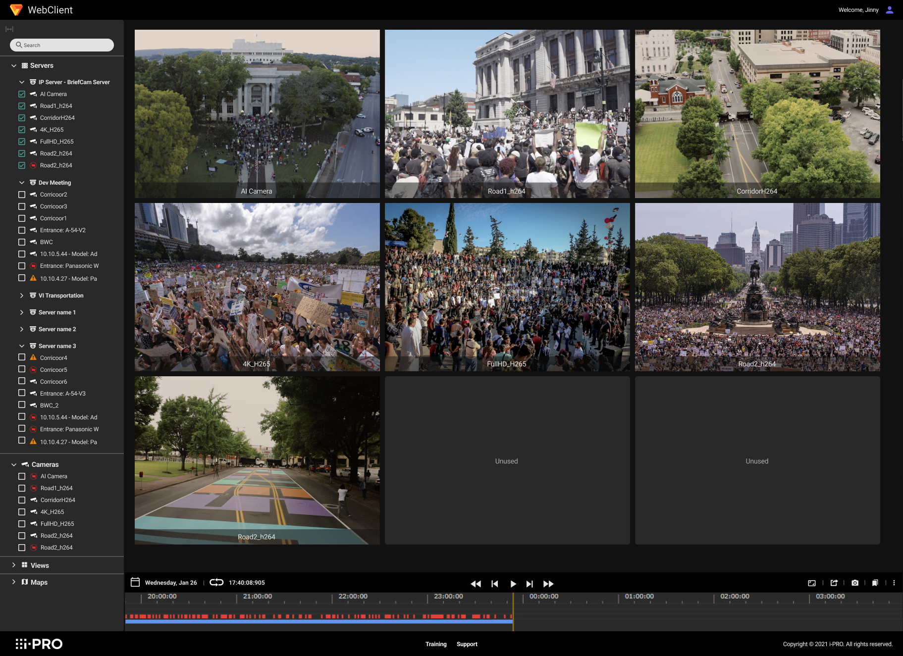
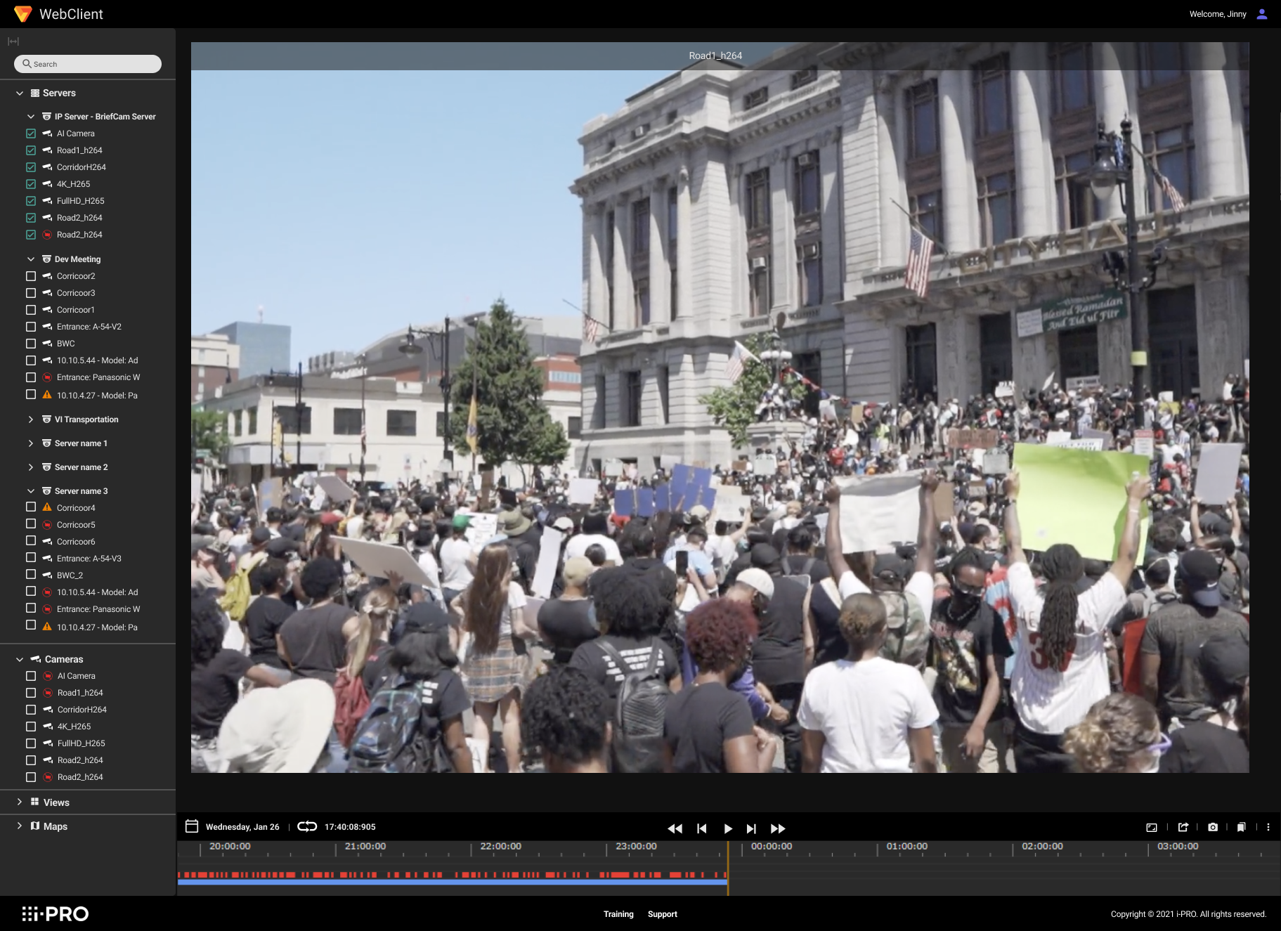
Scenario: User opens our VMS and lands on this page. What they are meant to do is choose a “camera layout” from the main content area, select a camera (s) from the left tree and drag them over to the layout to create a “camera view.” Users were also able to open plug-ins such as Active Guard which allowed them to use specific cameras like AI cameras instead of regular cameras without AI capabilities.
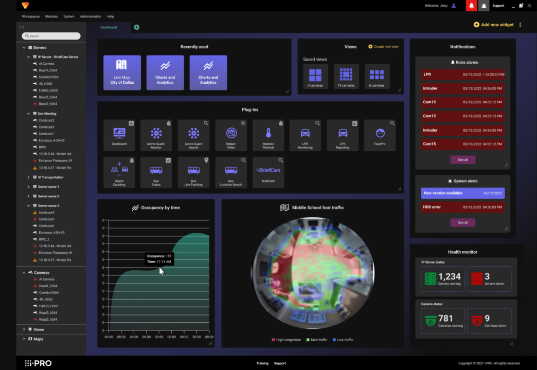
It was becoming clear that this landing page was mostly useless to our users. While it was functional for some of our newer users, our experienced users wanted something more robust. Something like a dashboard that could give them system and camera stats (number of cameras offline, cameras not working, servers down, etc.) and custom widgets like a live map, weather and traffic, and analytics.
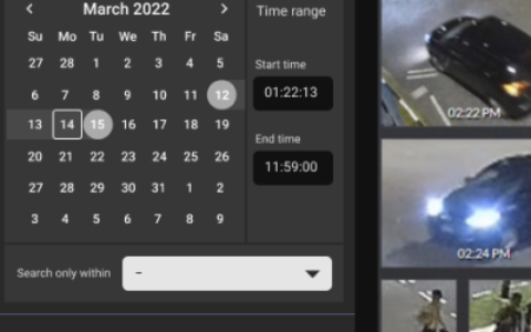
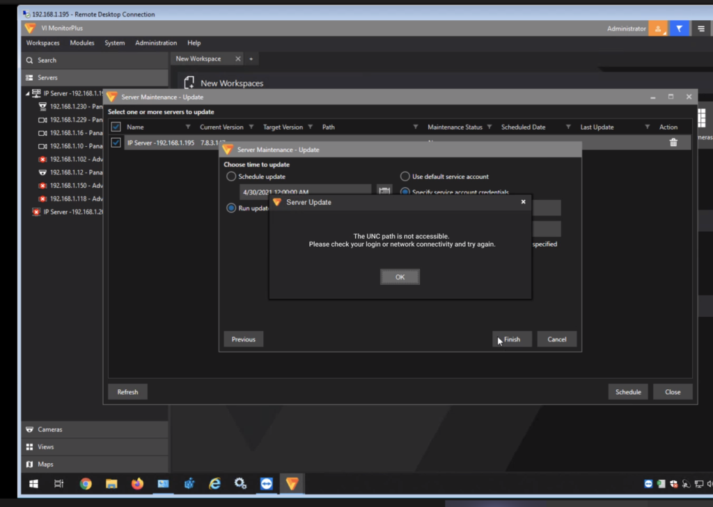
Scenario: Users especially complained about our timeline, which is the meat and potatoes of our products. It was terribly buggy and riddled with weird quirks like flashing at random times, crashes for no apparent reason, inability to zoom in down to the millisecond, and much, much more! If there was one feature the users didn’t delight in, it was this one. We knew it was of utmost importance to fix the bugs as well as improve usability, specifically tailoring the timeline to meet users’ exact needs.
If users were not able to zoom in to the precise moment of an event and analyze the event for legal purposes, our timeline was essentially useless.
Scenario: Lastly, users had grown accustomed to the Windows style of relying on popups to navigate a workflow. But it was just excessive. Users complained that they weren’t able to close popups because they needed to Cancel another popup first, but they couldn’t find the popup to cancel because it was buried beneath so many other popups. For a Mac user like me, it sounded incredibly frustrating and I wanted to figure out a way to reduce the popups and change the way our users flowed through their tasks.
I experimented on a natural “left-to-right” working style in which the users started a task on the left and progressed through their tasks by moving toward the right side of a screen, much like they were reading a book which opened up to the right. This concept was implemented in i-PRO’s Active Guard and it generated much positive feedback from users who did not like the popups workflow.
i-PRO 8.0 new concepts:

Page: Dashboard as new landing page
One of the first things I did was design a dashboard concept. A customizable dashboard is something most developers I’ve worked with usually balked at, but the positive reception this received from users during R&D proved that it would DELIGHT our users and put us at a competitive edge. They got excited over the idea that they could drag certain widgets onto their own customizable dashboard and create a “view” for users of different permissions and roles at their companies.
A police department could customize a dashboard for their Control Center analysts who needed to see only a live map, a panel of alarms being triggered by cameras, and facility maps. The police department’s IT office could customize their view to show only camera and systems health analytics so they could address which networks and cameras needed to get back online.
The visual design was modernized by subtle adjustments to the components on the page. I got rid of dated elements on the page like very hard edges, 8-9pt font sizes, harsh blocks of color, and underutilized empty spaces. These dated elements were replaced with translucent overlays, better use of padding and margins, and a cleaned up left tree with crisp, flat icons.
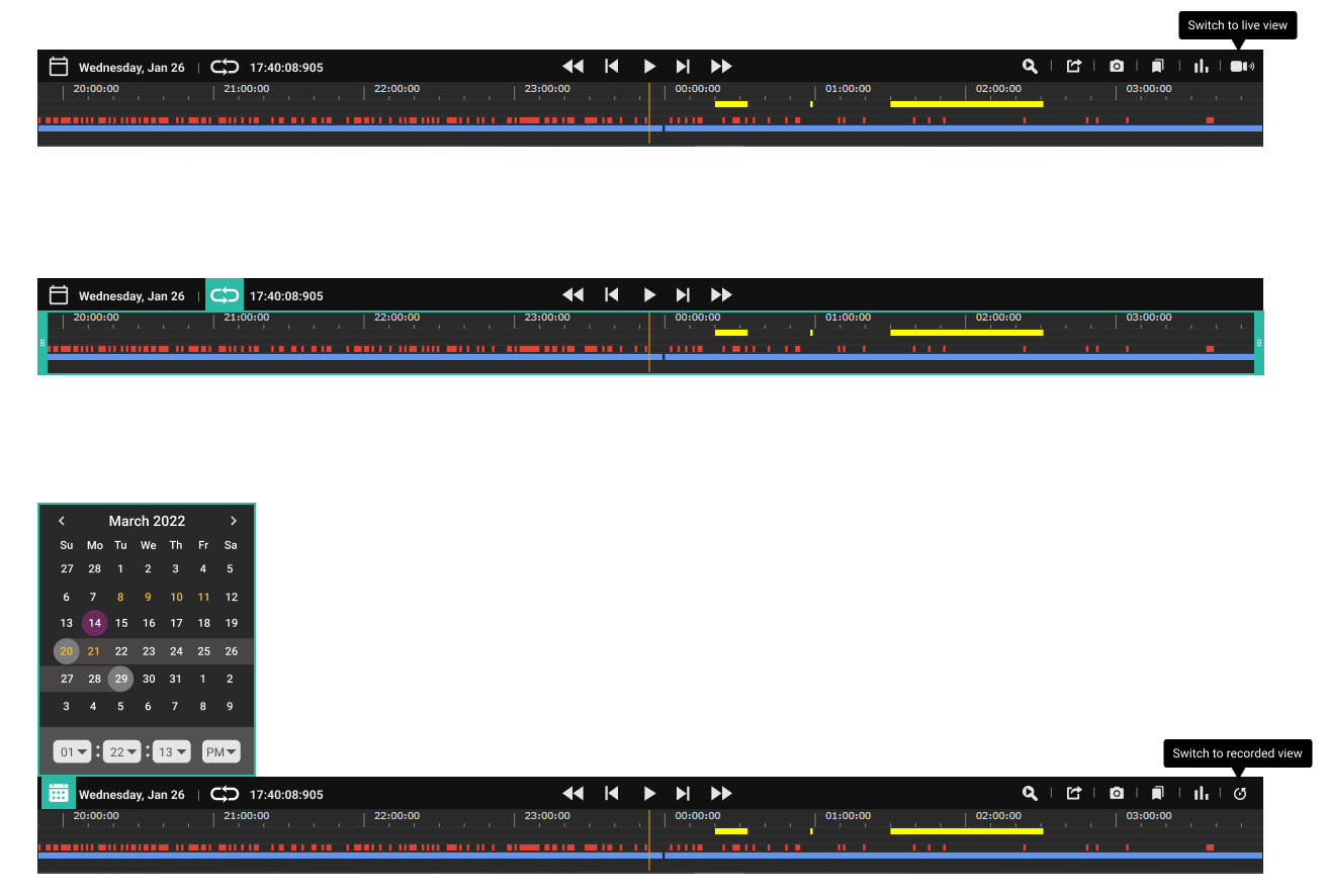
The timeline was also redesigned to look more like the timelines we were used to on Youtube, Vimeo, Final Cut Pro, Adobe Premiere, iMovie. The greatest difference between the old timeline and the new one was the rearrangement of playback controls. The old timeline had the main playback controls to the left of the timeline, which was not intuitive for most users. I used Youtube (who doesn’t use Youtube these days?) as my main source of evidence of what works for playback. Users were used to them being in the center, not off to the left. Users were also used to using key strokes to control the playback, not their mouse all the time. I also employed a lot of color to indicate what state the timeline was in e.g. looping mode, calendar viewing mode, and which buttons were interactive.
i-PRO’s internal stakeholders had mixed feelings about my new timeline proposal. They were afraid it was “too colorful” and users were used to the way it was. I explained that we sometimes force users to work the way WE WANT them to, rather than how THEY WANT to work. They were reassured when I tested the new timeline design on users at a trade show and the new design was received very positively.