Higg Co – Data Visualization
Higg Co – Data Visualization
About this project
The challenge:
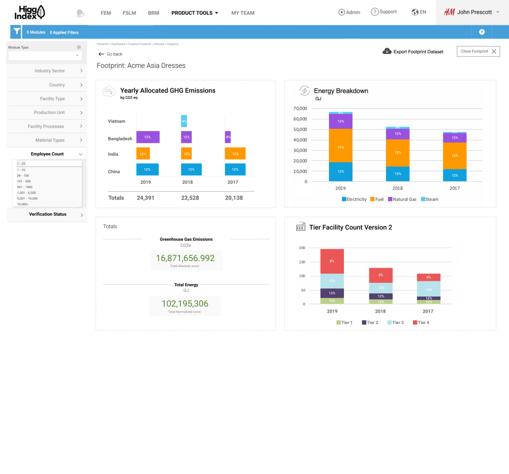
The Higg Index was working on a new Analytics tool that would provide important data on Greenhouse Gas Emissions, Wastewater, Chemicals usage, etc. per country’s facilities year-over-year. A part of that crucial data was Footprints. It allowed brands and retailers the ability to see what percentage of a facility’s output was theirs. This gave brands and retailers more accurate insight to where their sustainability goals were being met or not met.
Research phase:
Understanding CO2 emissions and environmental factors that contributed negatively to the world was new to me and it took quite some time with colleagues to learn the material. It was quite a learning experience to hear about supply chains and facility transparency and different country’s environmental regulations.
Diagnosis:
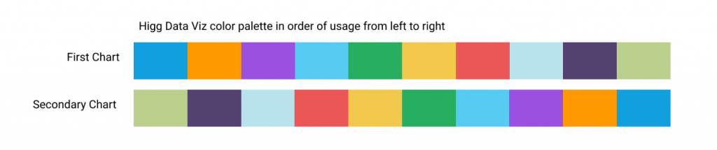
Once I understood the issue and the meaning behind these factors, I became concerned with the WCAG compliance of the Footprints charts (designed by a previous designer). Having worked on compliance for a previous project, I first focused on a color palette that would work for all types of colorblindness, including monochromatic colorblindness. Once I was confident the color version and the monochromatic version worked well, I focused on cleaning up the data visualization of Footprints so that the charts were easy and quick to understand. This meant I went with good old-fashioned bar charts instead of the fancy visualizations like scatter plots, boxplots, spiderweb charts, etc.
Wireframing phase:
Due to the speed of the sprints and primary goal to deploy code, my wireframing phase essentially became non-existent. I went straight to Figma to create full-color, code-ready designs that were iterated upon quickly and moved into development shortly after.
Design and Prototype phase:
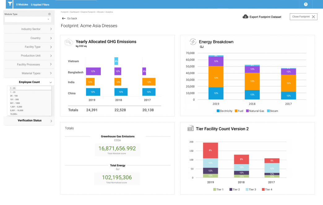
The original Footprints design (first image) had some issues including:
- X and Y labels that were not in standard locations
- some charts were hard to understand and could have been simplified
- colors were not WCAG compliant
The design I proposed (second image) was compliant and contained bolder text with simple icons to aid in visual comprehension.
Original design
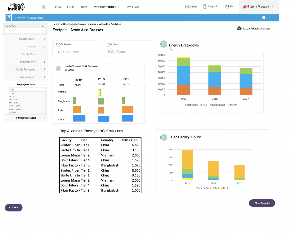
New design