First Quarter Finance
First Quarter Finance
About this project
The challenge:
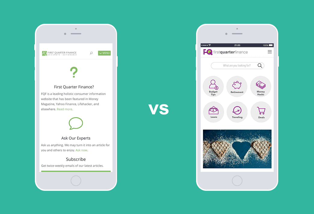
First Quarter Finance needed a website redesign because, well, everyone hated the current website–especially the CEO. Mostly because he had designed it himself, which I thought was impressive, but him not so much.
The initial assignment was to emulate a competitor’s financial website as much as possible within the limits of a WordPress theme with some custom coding where necessary. The competitor’s site was slick and well-designed, but I wanted to advocate for a start-from-scratch design process which included UX research and testing. It took some convincing because it would require extending the deadline to accommodate the research, but after a lengthy online chat he was on board.
Research phase:
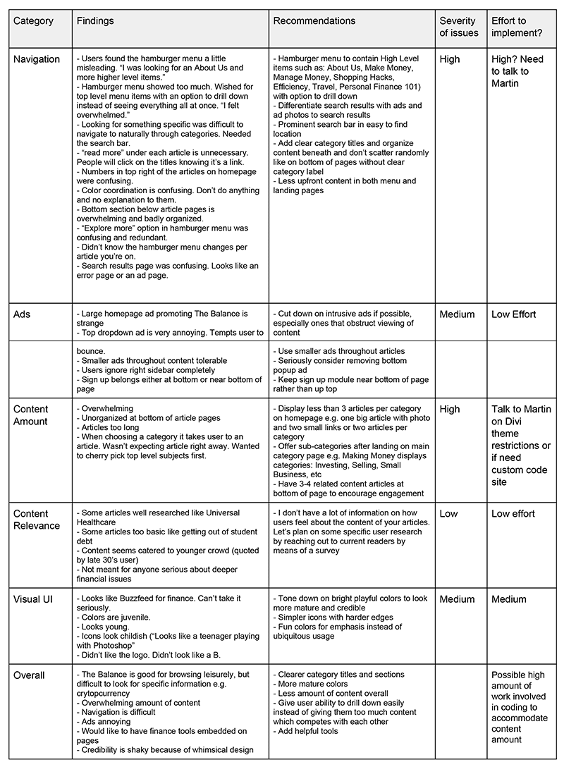
First things first–understand the company’s business goals and lock down on who their audience is. Next, gather business requirements and start gathering the right people to research and test with.
The content of the site revealed that the audience was younger and needed down-to-earth, practical advice on how to save money and make their money grow without the intimidating jargon. In a word, non-intimidating.
After testing with 7 users that fit the demographic criteria, I was able to go over some of the findings with the CEO who gave me the green light to use the data to determine the future design instead of simply emulating the competitor’s website. Score!
Diagnosis:
The biggest problem I needed to fix was a confusing navigation and UI that needed to be rearranged to encourage people to look around without getting stuck somewhere or stall there because the flow was broken. The site also needed a very strong branding facelift as it was relying very heavily on two colors and looked monotone and unexciting for a younger customer base. What I needed to tackle was:
- Reorganize navigation to be more intuitive
- Simplify user flow to enable easier content search-ability and make articles grab attention instead of peripherals like sign up and “About Us”
- Change color palette from green and black to deeper jewel tones and gradients
- Increase white space for visual breathing room
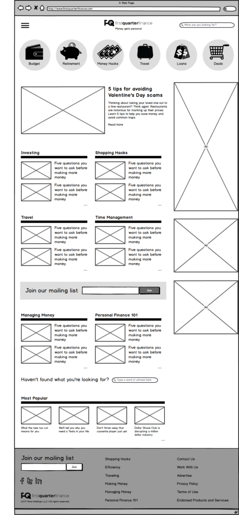
Wireframing phase:
Wireframes were built in Balsamiq Mockups after I had gathered enough supporting data. Users preferred less upfront articles and better search.
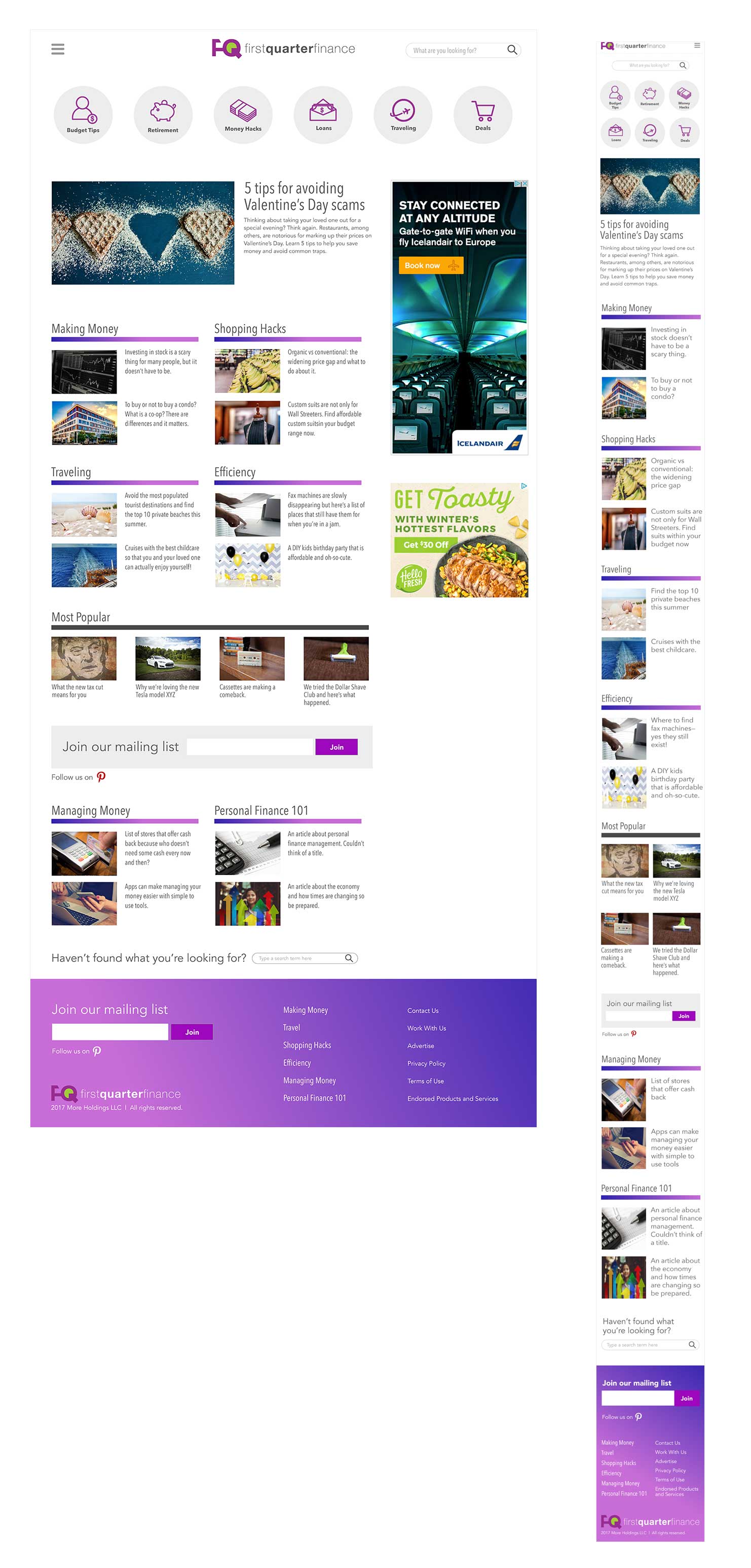
Design phase:
The design of the final website was mobile-driven with emphasis on a feature article, clearer categories for articles, and LESS available content to read upfront which was directly the opposite of their competitor. A deep purple gradient and logo redesign added richness to the page that appeals to a younger generation while still staying somewhat conservative to maintain authority. The work is still in progress, but this is how far we’ve come so far!