Lexington Christian Academy
Lexington Christian Academy
About this project
The challenge:
Lexington Christian Academy, a private college prep school based in the Greater Boston Area, gave me the challenge of redesigning their 5 year old website. This was particularly difficult because the school was experiencing an identity crisis which caused its market positioning to be undeveloped and scattered within the competitive academic landscape.
Research phase:
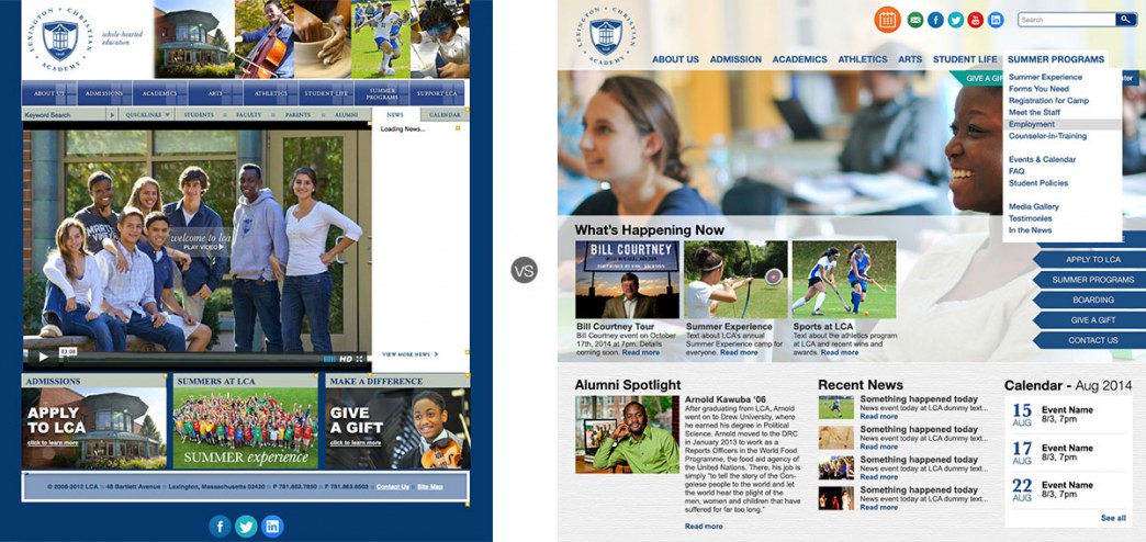
I spent the first few weeks interviewing the faculty and staff to try and pinpoint what made the school different, as well as taking note of the physical architecture. Research showed many of the faculty and current families of enrolled students did not like the current website and found it confusing and hard to navigate. They had resorted to visual memory to find desired information, but were unable to navigate to the rest of the pages when asked to. There were a general sense of discontent and defeat when it came to the website. Also, there was too much text and the font size too small for the web.
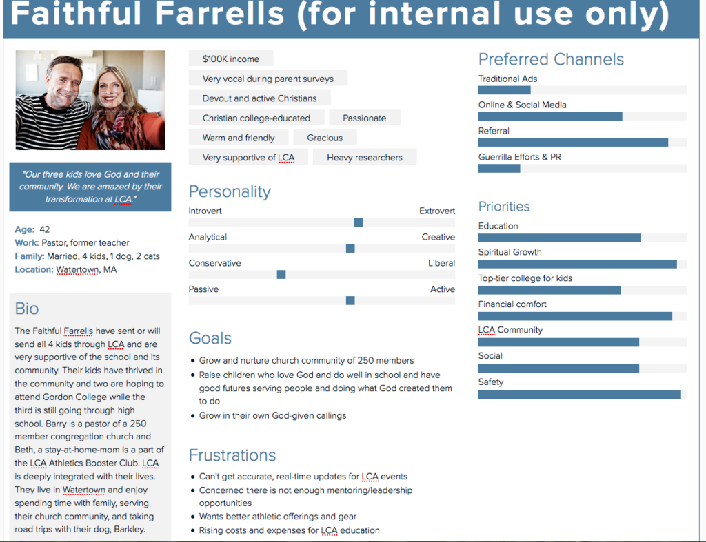
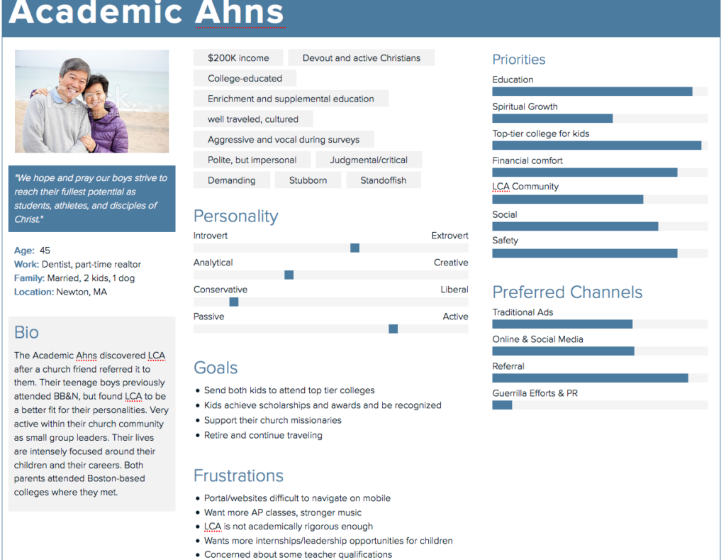
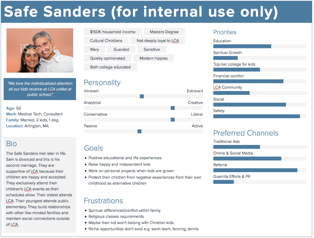
I was able to drill into the Admissions Department to learn more about the current family base and create three personas according to the data found through Admissions interviews and testings. Based on the personas, I began crafting the website content to appeal to those looking for safe, intellectual environments where fostered. I wanted to promote the academic rigor of the school while also carefully balancing the faith-based curriculum and supportive community without making the school look like a Sunday school.
Diagnosis:
Usability was very broken as well as the interaction design. The website needed a major visual upgrade as well as loving attention to prospective families who needed to find segmented information such as tuition, school profiles, college matriculation, etc., and current families who needed a Parent Portal organized to show them the most sought after information such as school calendar, athletic schedule, and student report cards.
- Reorganize navigation to be more intuitive while deleting content that was not marketable.
- Drastically reduce amount of copy and provide concise text that gets straight to the point.
- Change color palette to lighter and brighter to reinforce the school’s bright and naturally lit facilities.
- Replace photos with professional photos that showcase the school’s award-winning programs
- Add videos
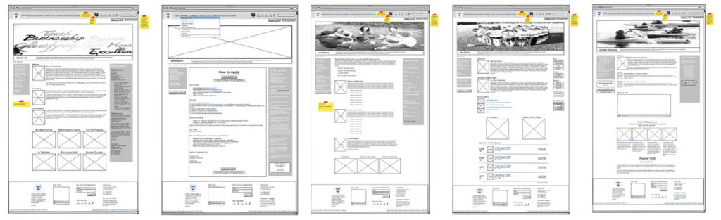
Wireframing phase:
Wireframes were built in Balsamiq Mockups after I had gathered enough supporting data. The biggest changes included making the new website full browser width as opposed to a fixed width. In fact, everything was increased in size including font, photos, buttons, and navigation.
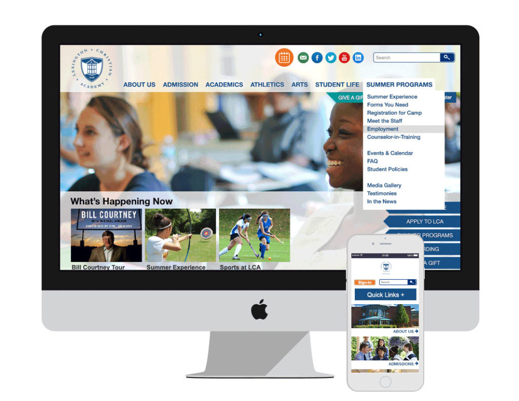
Design phase:
The design of the final website featured lighter, brighter colors to reinforce the bright, naturally lit facilities, while maintaining the brand’s navy blue for emphasis. Text buttons were replaced with graphic buttons and common navigational items like search bars and a quick links section were placed in intuitive areas.