Liaison University: Applicant Experience Improvements
Liaison University: Applicant Experience Improvements
About this project
The challenge:
Disclaimer: Due to company privacy concerns some information has been changed.
Liaison University is a school that participates in a Centralized Application Service (CAS). A CAS allows people hoping to enroll in higher education programs like Nursing, Engineering, and Business schools by submitting only one application instead of multiple.
Liaison University has known for some time that their applicant CAS experience was confusing and convoluted, specifically around the transcripts process. Applicants repeatedly missed program deadlines because there was no clear indicator of what requirements were necessary to complete their application in the CAS system.
I was tasked with conducting research to discover what pain points the applicants were experiencing and come up with some ideas to address these pain points.
Research phase:
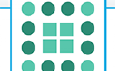
A usability test was conducted with half a dozen recruits at a community college nearby to gather initial feedback on the current transcripts workflow. I and a small team of interviewers sat down with individual recruits and led them through a short series of tasks that I designed to test their comprehension of the workflow and to note where they stumbled, paused, and gave up.
The desired action was for users to fill out a form with information from their last college attended. Once they hit “Save” they were shown buttons to request transcripts from their attended college and submit them to the CAS for review.
After testing, it was universally observed that users generally did not notice any call to action after completing the attended colleges form. Some users did not know why a “Download transcript request PDF form” button appeared. Some users clicked on the button and stared at the PDF in confusion. Some users did not notice the buttons at all and did not know how to progress through the application.
Diagnosis:
The most important solution was to make the transcripts request action more obvious to the user. We didn’t want applicants to miss their program deadlines because they didn’t know that transcripts were required from each college they attended in the past in order to complete their application. We also needed a way to show the user why they were being asked for certain transcripts (e.g. Official Transcripts, Unofficial Transcripts, Foreign Evaluations, etc.) and how to send them correctly. The following modifications were made to improve the workflow:
- Create an “alert” module that gives applicants a warning that transcripts are requested from the colleges they attended
- Explicitly list the different transcripts that are required with more instructions and helper text
- Make the call-to-action buttons more intuitive and actionable
- Add a visual confirmation after requesting transcripts
Wireframing phase:
Wireframes were done in Sketch to save time. The team met weekly to go over concepts, refine ideas, clarify any questions about the backend functionality of the CAS system, and once the wireframes were going in the right direction, peripheral team members like Operations and Customer Support were brought in to provide feedback since they knew customer complaints the best. The process lasted several weeks as iteration after iteration was made.
Design phase:
Disclaimer: Full redesign has been abridged for company privacy issues.
The final design, after many iterations, was selected when Product Managers, UX, Operations, and Customer Support agreed that it addressed the pain points discovered through user testing.