i-PRO Active Guard
i-PRO Active Guard
About this project
The challenge:
i-PRO is a global camera manufacturer and Video Management System company within the security and surveillance industry. They manufacturer some of the best cameras in the world with sophisticated features such as AI identification of facial features, sound distinction, and License Plate Recognition. Active Guard is i-PRO-‘s solution to staying competitive in a security market that depended more and more on sophisticated AI cameras to identify suspicious persons and to respond to urgent events. Our newest AI cameras are able to distinguish specific characteristics like facial hair, sunglasses, and types of clothing from other characteristics like gunshot sounds, glass breaking, and shouting. It was an extremely challenging feature to work on due to the following reasons:
- i-PRO’s corporate HQ (based in Japan) provided wireframes of specific features they wanted included, but without any solid user data to back up any of their design choices.
- Japan’s wireframes were overwhelming and not user-friendly.
- The Active Guard product team is in Japan and their development team is in Vietnam so there were significant language barriers to work through.
- There was much pushback from PM’s and developers on my designs because their value was a speedy release over usability.
- i-PRO wanted the product released yesterday
- I was brand new at i-PRO and to the security industry as a whole
The Japan team was lovely and their goal was to meet Sales numbers, which was understandable. Usability was very low on their priority list, but with enough respectful pushback from me, we were able to come to a reasonable compromise which reduced user cognitive load.
Research phase:
This was a brand new feature with no user research to back up anything except competitive market analysis. In other words, i-PRO (and other similar security software companies) tended to copy each other’s designs. This was also understandable since certain key tools were proven to work well for security users who tend to be in the older age range and less technical than the social media generation, but other tools could have benefited from innovation since many of these tools were created decades ago.
One of the first things I had to do (as the Design Lead who owned the end-to-end design process) was interview our users on how they currently used our software to survey camera feeds and identify pain points through these conversations. I learned that information overload was a typical pain point for our users, even if they were highly technical. Referring to our documentation was a common user scenario which told me our UI/UX was not intuitive and we presented too many options at once. After speaking to our users, account executives, and tech support I felt I had enough usability feedback to tackle some wireframes.
Diagnosis:
Feature overload. Massive problem with i-PRO’s products in general. Since the backend developers were acting as both designers and developers in the past, products were developed with speed and practicality in mind. Unfortunately, this meant that options were placed wherever there was an empty space rather than where it intuitively belonged (grouped with same category options). User workflows were also disconnected and lacked consistency in behaviors and in visual branding since components were taken from generic libraries. Discoverability was also an issue because many options were buried under other options. i-PRO did not have ease-of-use or intuition in mind when developing their products.
I needed to rearrange the information architecture, reduce cognitive load by making it clear where the CTA’s were and distinguish them from secondary options (and there were many) on the page, and improve workflow by introducing a left-to-right workflow rather than relying on popup window after popup.
Wireframing phase:
Due to the speed of the sprints and primary goal to deploy code, my wireframing phase was done in Figma to create full-color, code-ready designs that were iterated upon quickly and moved into development shortly after.
Design and Prototype phase:
The great thing about working with Japan team was that anything I designed was better than what they were used to since they had never worked with a designer before and developers typically “designed” their products. The bad thing about working with Japan team was that they took anything I designed and wanted to run with it. I had to act as the overly optimistic designer hoping my first design would get approved without any objections, and also act as my own gatekeeper so that a first design pass WOULDN’T get approved without some reasonable amount of scrutiny.
Also, since this was a brand new feature, we knew we had to release the product to collect real usability feedback and revisit.
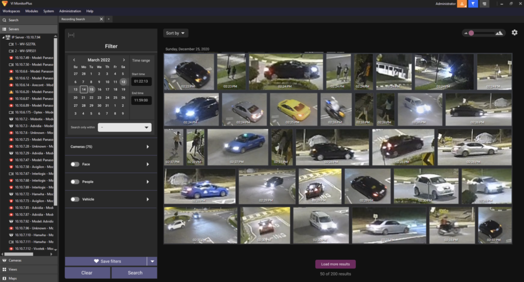
Wireframe concepts from Japan product team
Scenario: User opens the Active Guard plugin and launches a screen with a filter on the left and a search results area on the right. This was simple enough, but the problem was that the filter module did not look like filters with odd unused negative space that did not have any function to them and arrows with no clear intent. The colors in the UI were improperly used; there was no way to distinguish which components were interactive and which weren’t.
Scenario: Once a user clicked on a filter facet, a popup window would display to allow advanced filter options.
However, the UI is designed in such a way that it assumes the user should know what to do, even though the layout was unclear. There was not enough proper labeling and clearly defined containers e.g. advanced filters on left, results on right. i-PRO relied on heavy training and dependency on documentation to guide the user through the workflows.
New designs:
(first iteration)
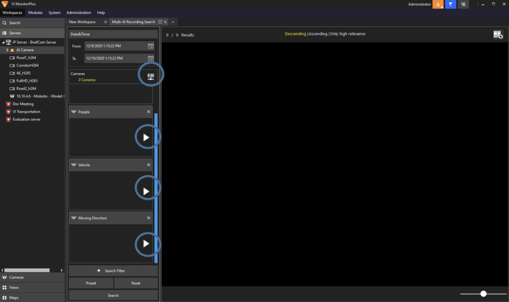
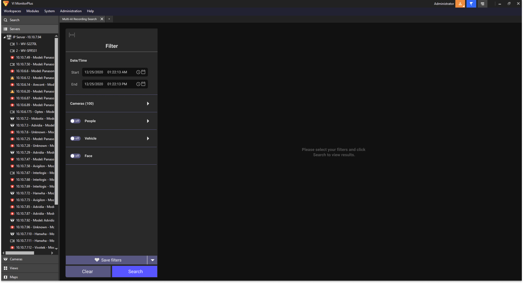
Page: New Active Guard plugin(empty state)
First, users were greeted with an empty state that explained what their first step should be via helper text in the middle of the screen. The left rail filter module was designed to:
- incorporate brand colors (i-PRO indigo)
- utilize color to distinguish between non-interactive components from interactive
- look more like a traditional filter that people were accustomed to
- modernize components to look contemporary instead of dated
A left-to-right workflow was incorporated to reduce the number of popup windows. This decision was made as a direct result of user interviews which revealed users experienced frustration when popup windows stacked on top of each other and they could not close all of them quickly enough, or close them at all!
Additional colors were used to indicate when elements on the page were selected. Headers and sub-headers were utilized to clarify what each container’s intent was.
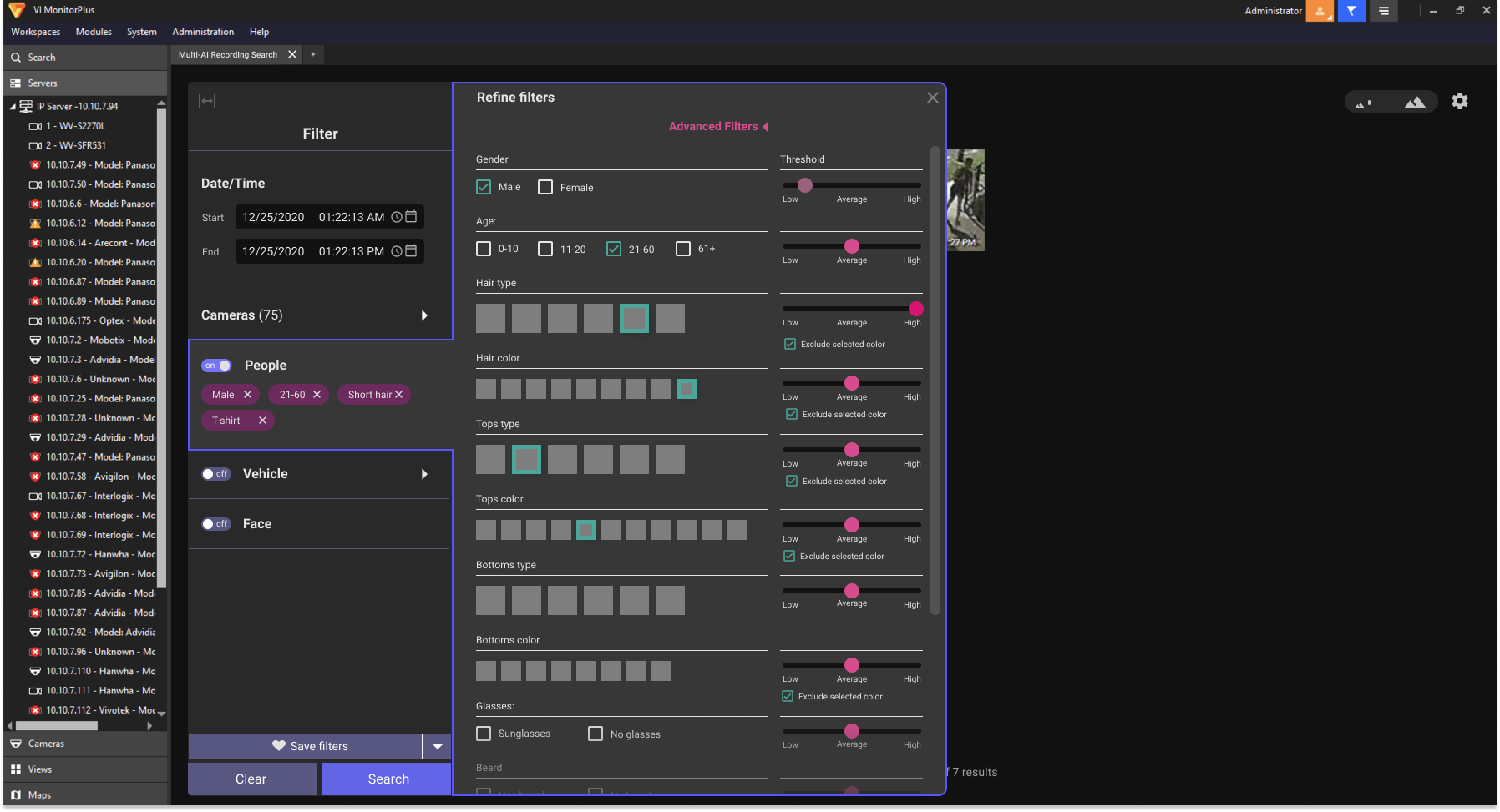
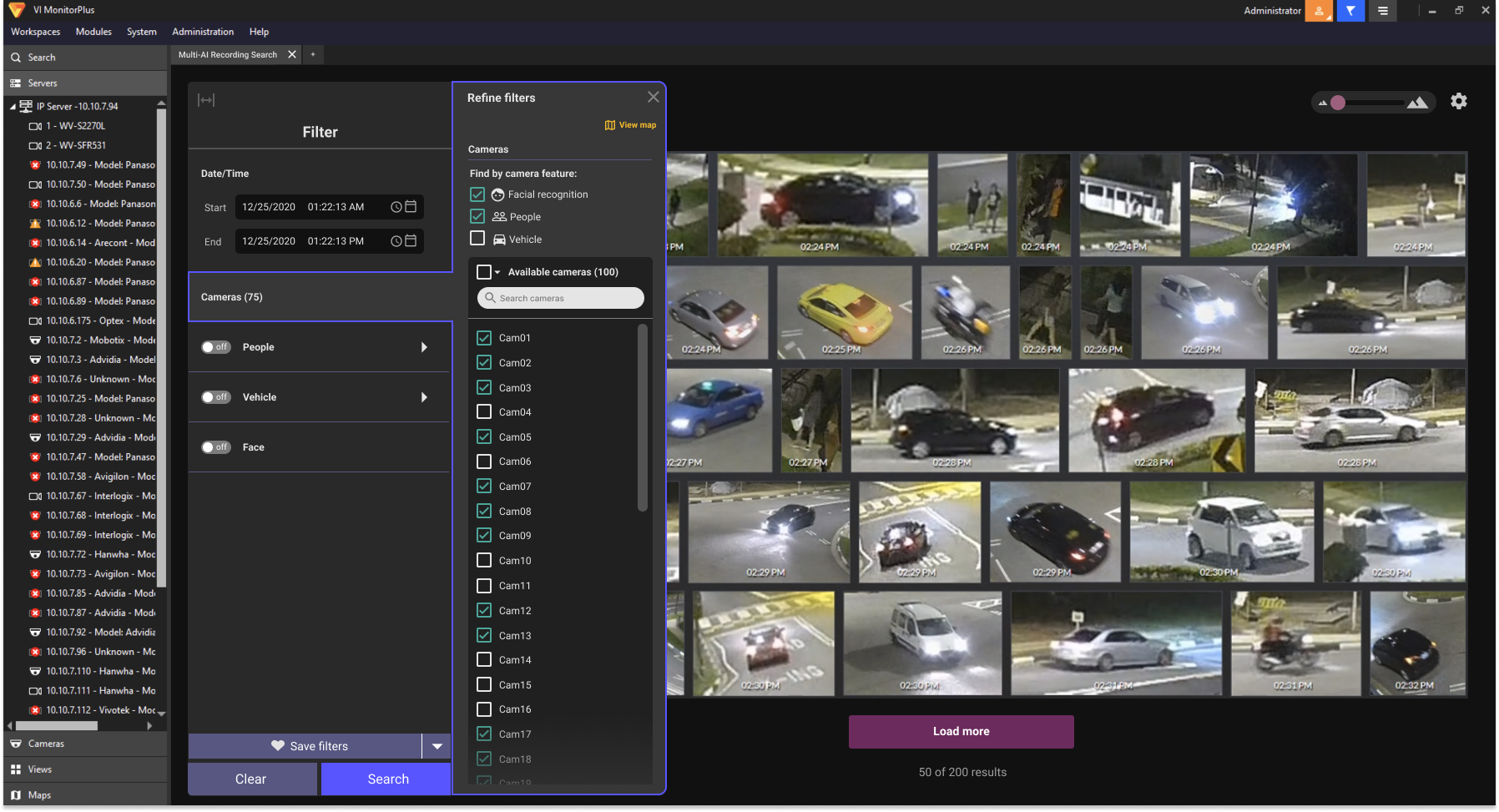
Advanced settings were hidden by a link in order to prevent users from feeling overwhelmed by too many options at first glance. There was some debate with the Japan product team over whether the threshold options needed to be available by default view, but it was deemed that most users were going to use the main filter facets first. Only extremely savvy users would use the advanced thresholds (unless disproven through user testing later).
Second iteration:
(after user feedback)
After Active Guard was released into the wild and users were able to use it for a few months, our Product Manager went on-site to collect feedback from our users (schools) and returned with some negative feedback such as:
- The default view of options was intuitive, but still overwhelming for users (especially less technically savvy users like school administrators)
- Users did not like all the clicking to set dates and times
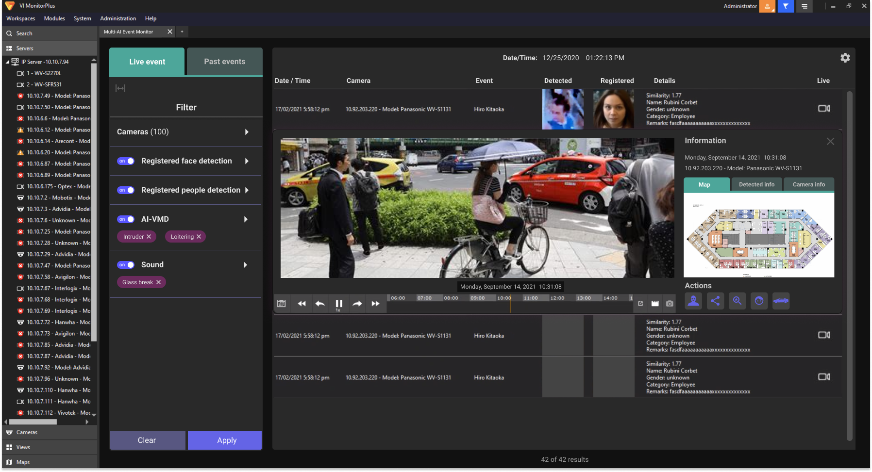
- The video playback window disrupted the user’s workflow because it was placed in the middle of the screen and split the screen in half visually
- The video playback window also flashed when a user hovered over the area with their mouse.
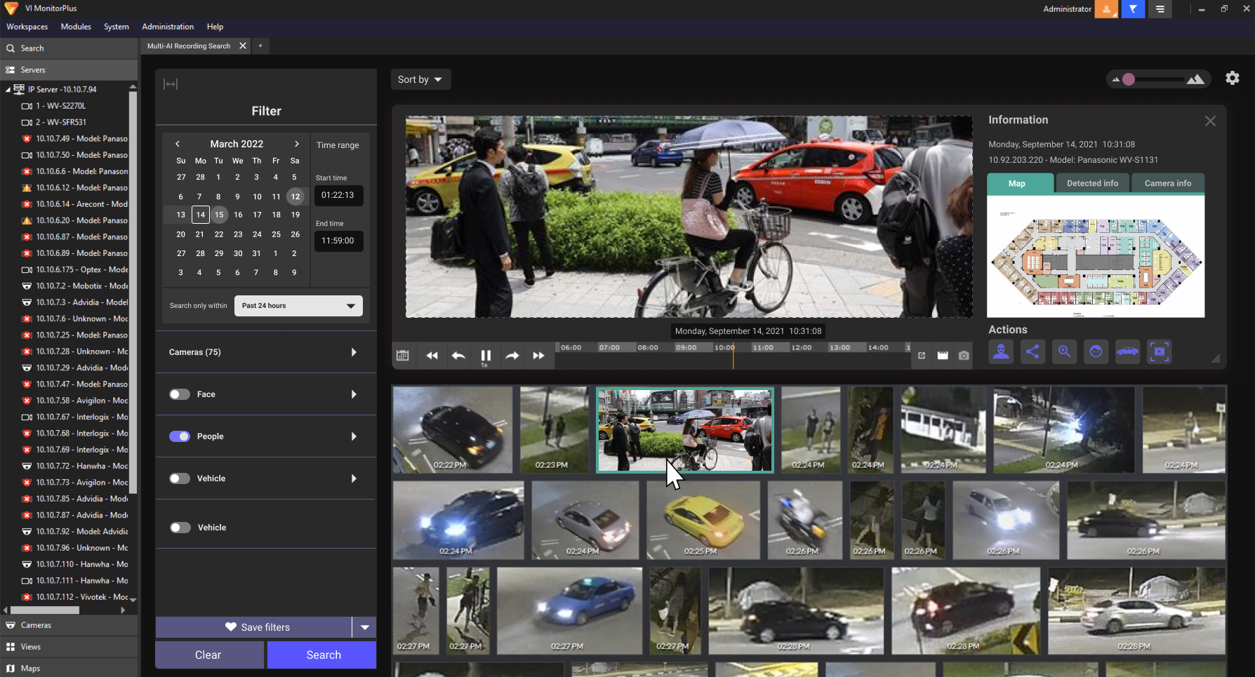
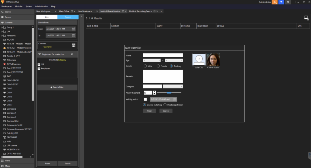
One of the first things the Product Manager and I talked about was moving the location of the playback window so that it did not split the workflow in half. We also wanted to balance the two tasks of checking playback while also searching through search results. Both were equally important to our users.
There were some ideas to move the playback window to the right side as a drawer that slid in and out, but ultimately it didn’t solve the issue of having space for the user to perform both playback and search tasks simultaneously. The best solution was to move the playback area to the top of the screen and allow the user to pop out the window if they wanted. Since our users usually had 2-3 monitors on their desks, this was a great way for users to view many things at once.
I also proposed a new way of doing our date and time selection. We got rid of the “START time and date” and “END time and date” input fields, and replaced it with a straight-forward calendar widget much like what travel websites use. It was a decision I made after hearing that users were frustrated by so many clicks to get a task completed, and setting a date and time range were essential tasks for our users.
The new designs were socialized internally before given to users to review for feedback. Developers were able to release the updated version and the feedback has been positive so far!